
Grid is a simple block that created of horizontal or vertical or curved guidelines to make eye-catchy designs. With the help of Grid, one can easily arrange graphical elements systematic.
When we are designing web page, we find a system of rows and columns to control the page layout by utilizing a set of CSS classes. Thus, we are considering Grid systems an important part of web designing.
Today, we have a collection of option available for CSS grid systems. Here, we are listed some of the best and most recommended CSS responsive grid systems to use when designing beautifully responsive site layouts with ease.
Table of contents:
Flint Jaidee BlueSkyGrid System Crow Grid Framework Unsemantic CSS Framework Skeleton Neat csswizardry-grids Profound Grid Columnal CSS Griddle One% CSS Proportional Grids Responsive Grid System Herow Gridlock Kube CSS FrameworkFlint

If you are looking for a rapid responsive development, then Flint is a highly advanced Sass grid framework to check out. It is a responsive grid framework that written in Sass and enable developers to create responsive layouts that created on a sophisticated foundation.
Hire on-demand dedicated developers of desired skill & experience.
Jaidee BlueSkyGrid System

Jaidee BlueSkyGrid System is another popular and lightweight Responsive Grid Framework that is mostly appreciated by web designers.
Crow Grid Framework

Crow Grid Framework is made standalone that means web designers can easily apply to any of their current markup/web project. It is especially stands for column-row.
Unsemantic CSS Framework

The successor to the 960 Grid System, Unsemantic is an amazing fluid grid system. It works just like the 960 Grid System, but rather than using a set number of columns, it is based on percentages.
Skeleton

Skeleton is the best collection of CSS files for website designers, who want to create responsive grid layouts. Skeleton delivers you some basic features for dealing with common web layout tasks like CSS reset to normalize CSS.
Neat

Neat grid framework is used to promote clean semantic HTML markup. It uses Sass mixins to avoid additional presentional classes and wrapping div elements. Thinking to use NEAT then get started by reading docs and studying some examples to implement.
csswizardry-grids

Being a responsive grid system’s approach, this framework is all about designing web layouts mobile first. Those web developers, who are concern about populating of markup along with an overabundance of presentational CSS classes, can have an option of Sass’s @extend feature with csswizardry-grids.
Profound Grid

The best feature about Profound Grid is it precise in rendering fluid grid layouts in all the browsers it supports. They achieve such feat by using negative margins to calculate column dimensions.
Columnal CSS

This grid system is the best combination of a couple others with some custom code thrown in. it is an elastic grid while some code are inspired from 960.gs.
Griddle

Griddle focuses on the modern browser. It generates by using Sass functions and mixins. It also leverages the powers of CSS inline-block and box-sizing properties that provides layouts to some new abilities that doesn’t provide by traditional float-based layouts.
One% CSS

One% CSS Grid is a 12 column fluid CSS grid system that designed as a base for developing responsive web layouts with minimum effort. When using this system, you don’t have to resize and rearrange your layout for each platform separately.
Proportional Grids

Proportional Grids enables to solve the problem that raised due to rescale our layouts, and disproportionate sizes of gutters between different viewing situations. It enables users to fixed units of measurement and being able to have fluid columns.
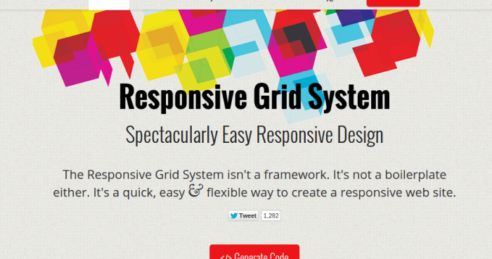
Responsive Grid System

Responsive Grid System is not a framework or a boilerplate. It is a quick, easy & flexible way to develop a responsive web site.
Herow
Herow is a timesaving Sass grid system, offering mixins that are simple and easy to customize. It’s atomic mixins are best to deal with responsive problematic. Even, users can easily generate atomic classes to play with it directly in CSS.
Gridlock

A truly mobile first approach towards website design is showed by Gridlock that reverses the responsive web design media query logic. It helps to improve rendering speed a tad bit on mobile browsers.
Hire dedicated team for your next web development project.
Kube CSS Framework>

One of the most advanced and flexible frameworks, Kube helps to spend more time on routine tasks and helps to develop fabulous products. It focuses on success and cover technology behind it.
These are 15 best collections of grid resources for web designers to check out. If you are looking for more information about these resources, then visit here.


